
How AI Can Boost Predictive Maintenance In Manufacturing
How can Artificial Intelligence be used for predictive maintenance in manufacturing? New software technologies are helping business operations.
 David Curd

NAV 2013 allows you to display two types of chart; what are referred to as Generic Charts and more advanced charts known as Extended Charts. Generic Charts are the same as what has always been available in the 2009 RTC, but with a new set of accompanying objects to make the job of creating and modifying your charts much easier. Extended Charts use the Business Chart Add-in which requires some NAV development experience to create charts with, but allows you much more control over the charts run time.
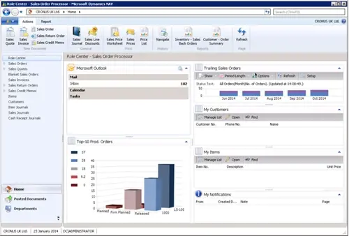
The recently released RTM version of the Cronus database has a good example of the difference between the chart types. The first thing you see when running the RTC is nice extended chart on the Sales Order Processor Role Centre.
This gives a breakdown of open and released sales orders grouped by months, however it leverages the functionality of the Extended Charts by allowing the user to set their own period length (Day, Week, Month, Quarter, Year) and choose whether to show the number of orders or value of the orders. This is where the Extended Charts excel, the user has a regular need for a chart, but needs the ability to be able to adjust it to show the data as needed each time they use it. The regular business need means it is worth the small development cost up front to create the chart.
On the other hand Generic Charts give two levels of ease of creation to allow you to create either completely ad-hoc reports based on any list page, or with slightly more design work by the user based on any page or query (an exciting new object type in NAV 2013 which allows you to combine tables together as you would in SQL or Access).
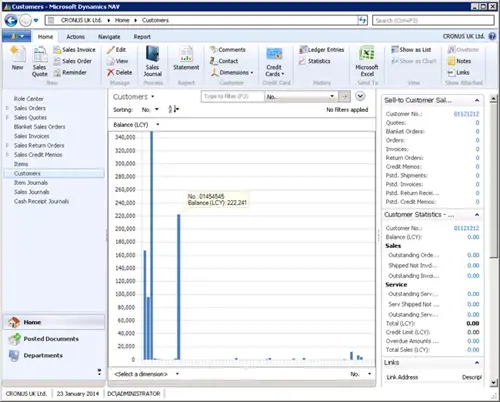
For example from the standard Customer list I can click Show as Chart, select an X dimension (No.) and a Y dimension (Balance) and I’ve instantly created a chart which would have taken knowledge of defining the charts in XML to achieve in NAV 2009. This can be done by any user of NAV as a way of quickly visualising any data they have access to.
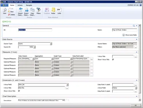
As mentioned charts can now easily be created without being based on an existing list. The Generic Charts list (CRONUS UK Ltd./Departments/Administration/Application Setup/RoleTailored Client/Generic Charts) contains 45 charts which contain some good examples of this functionality.
For example the Top-10 Prod. Orders chart below would take very little time to create:
Once the chart is defined you can add a chart part to a role centre, customise the part to select the chart to display in it and you chart is finished.
Both types of charts have a lot of potential and I look forward to seeing how a customers use them in the future.

How can Artificial Intelligence be used for predictive maintenance in manufacturing? New software technologies are helping business operations.

Summarising technology changes for manufacturing companies in 2023 and what that means for 2024 such as artificial intelligence and industry 4.0

Manufacturing, Warehousing and distribution company Colorlites implements Business Central ERP with Dynamics Consultants in a phased approach